
The Coastline Paradox
👇 Get new sketches each week
How long is the coastline of Britain? The surprising answer is: it depends. This is the essence of the coastline paradox.
What is the Coastline Paradox?
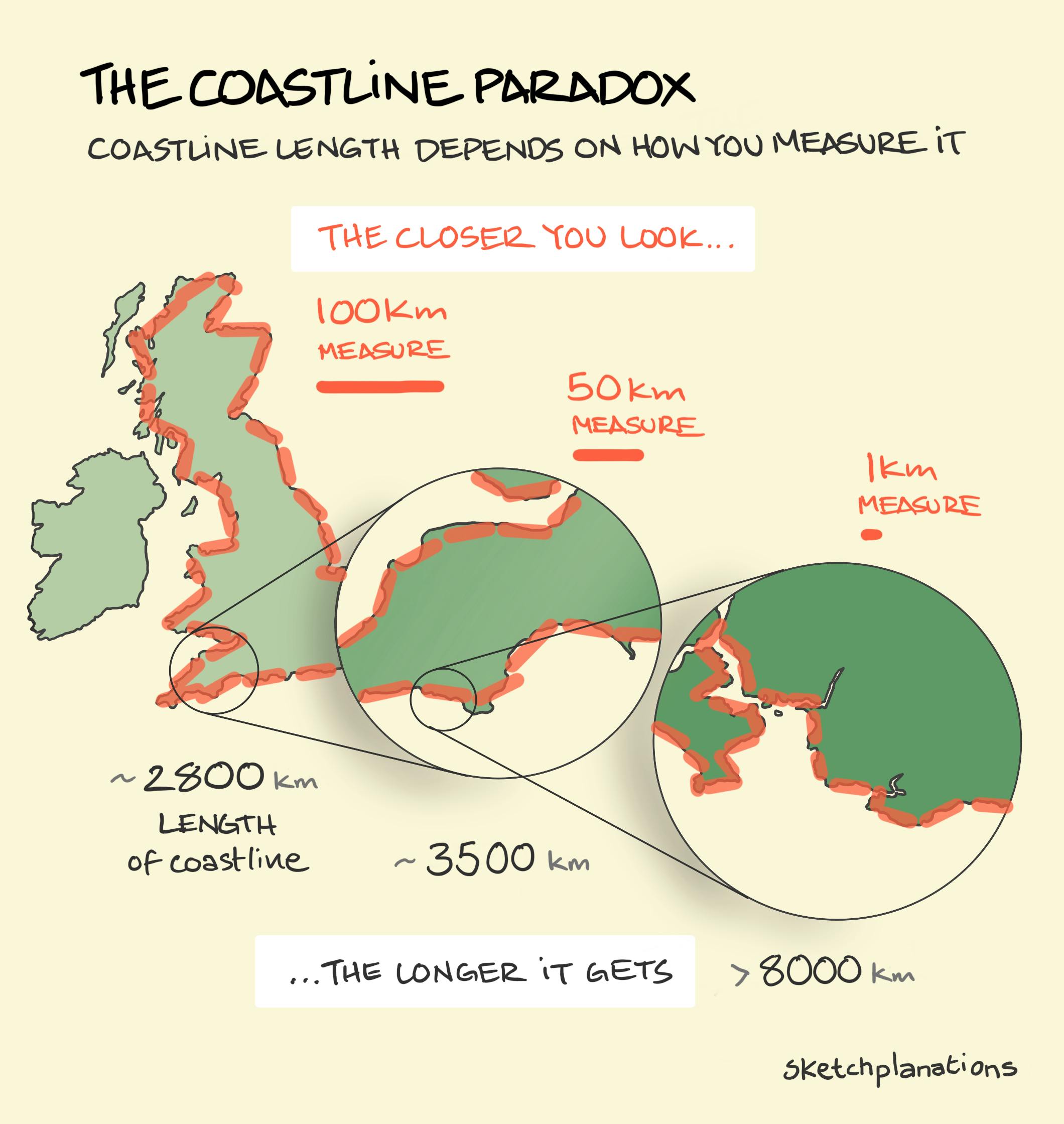
The coastline paradox, sometimes called the coastline problem, is the observation that the measured length of a coastline changes depending on the size of the ruler you use and how closely you look. If you measure Britain’s coast with straight segments of 100 km, you might get around 2,800 km. Reduce the step to 50 km, and the length increases to about 3,500 km. Go down to 1 km, and the length leaps to more than 8,000 km. The closer you look, the longer it gets.
Why does this happen? Coastlines are full of detail. If you were to measure the coastline of a country using a ruler on a globe, you’d get a very different result than if you paced around every bay, inlet, and headland. The closer you look, the more wiggles and squiggles you find. And instead of converging on one “true” length, the coastline just keeps getting longer. The smaller your measuring stick, the longer the coastline appears.
Origins of the Coastline Paradox and the Fractal Dimension
This effect was first spotted in the 1950s by the Englishman Lewis Richardson, while testing a theory that the likelihood of war between countries depended on the length of their shared borders. He found something remarkable: the quoted lengths of borders varied widely. By measuring with different map scales (or smaller callipers), the measured length systematically increased.
When examining coastlines rather than borders, Richardson noticed that some countries’ coastlines grew faster than others as the scale shrank. Norway’s crinkly fjords, for example, produced a much sharper increase than Britain’s, which in turn increased faster than South Africa’s. This rate of increase later became known as the fractal dimension of the coastline. In some ways, it's a measure of the wiggliness of a coast.
Long after Richardson’s research, Benoit Mandelbrot published a paper, "How Long Is the Coast of Britain? Statistical Self-Similarity and Fractional Dimension ", that discussed how the wiggliness of something like a coastline at one scale can be repeated at smaller and smaller scales. The work led to the later term fractals.
Many other things exhibit fractal-like behaviour, such as river networks, mountain ranges, borders, brains, frequencies, lightning, and even the stock market. There’s a super section on this in Scale , by Geoffrey West. And it's also covered in my Dad's book (!) The New Quantum Universe .
So is there a true length of a coastline? Not really. That’s the paradox. At very small scales, the length approaches infinity. Crazy.
Related Ideas to The Coastline Paradox
Also see:
- The Mercator Projection
- The difference between Great Britain, and the UK
- Strahler stream order
- The 3 Tallest Mountains
More paradoxes:
- The transparency paradox: the more transparent the workspace, the more privately people behave
- The paradox of choice: more choice can make it harder to choose
- The automation paradox: the better the machines get, the more we struggle when they fail
- The Abilene paradox: a group can take an action that no one thinks is good
- The liar paradox: I am lying
- The paradise paradox: the belief that moving to paradise will solve all our problems
- Jevon's paradox: Fuel efficiency gains tend to increase fuel use
I updated this sketch from the original for my book Big Ideas Little Pictures
